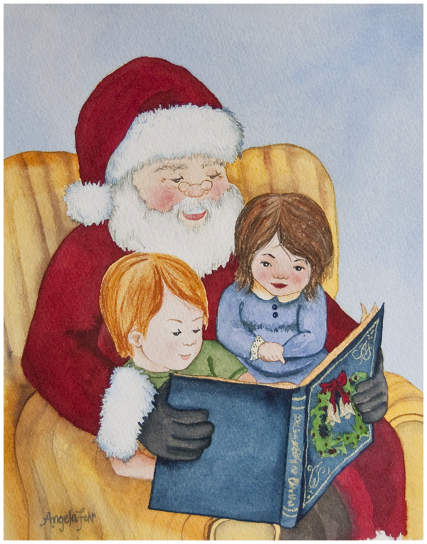
Watercolour Painting: Santa Reading to Children
The Dawson Creek Public Library is one of my favourite places. Hundreds, maybe even thousands of the books in that humble building bear my fingerprints. As a child I was a speed reader and a Beverly Cleary fan, and I used to have half of my books read before we left the parking lot. The library staff and I are on a first-name basis, and Jenny Snyder, who runs the library, has been a long time supporter of my painting. I'm always delighted to receive a commission from her, either personally or on behalf of the library, and last year she mentioned a desire to see one of my paintings on the library's Christmas cards.
We didn't get to it last year, but this year she approached me "officially" with her request, and while I had never painted a Santa scene before, she knows my style well enough to trust me on the outcome.
It was fun to paint a sweet, simple scene like this! For the pose, I used an old photo of my husband reading to our daughters when they were small, and adapted the faces to suit, as Wade owns neither a Santa suit or a beard! I sketched out my design in my sketchbook, and then refined the lines by tracing the image onto tracing paper. I then took that finalized sketch and transferred it to watercolour paper using graphite paper. I really like yellow graphite paper for watercolour since the lines don't show in the finished painting. Sometimes with grey or black graphite paper, I will go over the lines with an eraser prior to painting, and make them as faint as possible so they don't show through the transparent watercolour. Never use carbon paper for watercolour since it contains oils that will resist the watercolour paint.
Because there were two areas in this painting that require whites - Santa's beard, and his fur cuffs and hat trim, I used a warm white and a cool white to differentiate between the grey shadow areas in the whites. Grey is made by mixing two complementary colours (like green and red, or orange and blue) and you can make a grey warm by adding slightly more of the warmer of the two colours (i.e. orange). Cool grey is made by adding more of the cool colour (i.e. blue).
This painting didn't come completely trial-free, and I'm going to share a bit more of my process in a future post. I'd love to know what you think of this fun venture into a more illustrative style, and if it gives you a little Christmas cheer!


