Opaque & Transparent Watercolours
One of my early art instructors encouraged me to use raw sienna instead of yellow ochre in my watercolour palette. The two colours are similar, but raw sienna is transparent, while yellow ochre is more opaque. Before that I'd never thought about this quality of paint, I had assumed that all transparent watercolour was the same.
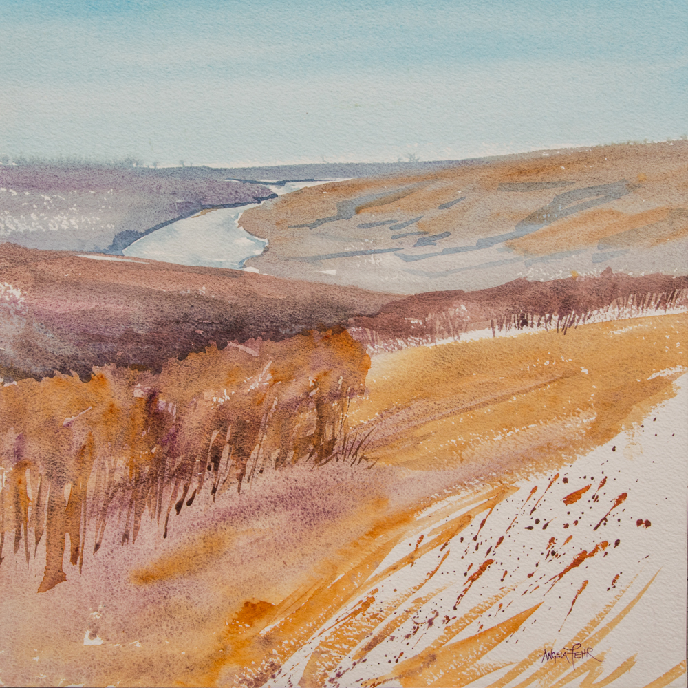
Exploring earth tones in my painting , "Peace River Palette"
Watercolour is never truly opaque; we call opaque watercolour ‘gouache’ and it is its own medium with its own techniques. However some pigments are less transparent than others. For many years I used only transparent colours, and there's a lot of benefit in sticking with a transparent palette. You get more richness in layering colour, and less muddiness. The paper shows through a wash better, so your pale washes glow with light. Even dark washes get a jewel-like richness when mixed from transparent colours. Two extremely transparent colours that I love are Phthalo Turquoise (really, any Phthalo hue), and Transparent Orange.
An opaque blue glows over darks - a mix featuring Cinereous Blue
However, I have started using more opaque colours over the last few years, and see the benefit of their use in my paintings. I believe a strong painting has both rhythm and variety, and dashing in some opaque colours in the detail stage can add a quick high note of variety, an exclamation point of interest. I've also noticed that many of the blues I love to use for skies have opaque qualities. It seems to make the blues brighter.
I like adding a light opaque colour toward the end of a painting. I can splash it in wet-in-wet to tone down a very dark wash, or dot bright opaques over dry painting. Remember that opaque colours will demand attention, and need to be added sparingly if added alone. I have also noticed that these colours don't play well with others if you are mixing a colour in your palette. For a wash of a single mixed colour (like mixing yellow and red to get an orange), I choose transparent colours.
When I see my choices changing, as I have with this new liking for opaque colours, I see it as a sign of progress. Early in my painting journey I was busy thinking about how to get the paint to do what I needed it to do, and didn't have room in my brain to compare qualities like transparency and opacity. As my skills have developed I have been able to find a place for opaques in my paintings, and I'm sure that they will continue to find their natural place in my painting process as I experiment with them.
A few colours I love for their opacity:
Venetian Red (Daniel Smith)
Wisteria (Daniel Smith)
Yellow Ochre (Sennelier)
Cinereous Blue (Sennelier)
Cadmium Yellow Med. (QoR)
A quick way to judge the opacity of a colour:
I squeeze my paint from tube into palette, so it's not always convenient to read the label. You'll know your paint has a degree of opacity if your paint water looks "milky" after rinsing your brush. Another way to tell is to stroke a wash of paint over dark paper and see how well it shows up. Remember that any paint will look opaque if you put it on thickly enough, so try to have the mixture an "inky" consistency when testing its opacity, and you'll get a more accurate sample.
Handprint has a very detailed article on qualities of paint relating to transparency. Read it here.
I receive a small commission when you order using the links above. Thank you!
There’s more!
Sign up for a series of emails designed to help you become a more Fearless Artist.


