
My Favourite Shade of Spring
Truthfully, I think I could call one particular hue my favourite shade for almost every season. It shows up in nearly every painting I create, perfect for taking centre stage with energetic flair or accenting with a pop of colour. And sometimes I sneak it in, mixed with a complementary hue to create a fascinating neutral.

Yes, it's cobalt teal. The variety I use is Cobalt Teal Blue from Daniel Smith, and this colour found its way into every painting in my 2018 spring painting collection, which I'll be revealing later this week.
I'm not alone in loving this vibrant, calming shade of turquoise. Keiko Tanabe listed it as her favourite hue in a recent American Watercolor article, it figures frequently in paintings by Stephen Quiller, another colour-wielding master, and outside of the art world, it's a favourite as well. In 2018's colour palette for home decor and fashion, you can find pops of teal from near-neon to a subtly greyed silvery turquoise that looks beautiful in almost any environment. I filled my Pinterest inspiration board with looks to inspire my paintings and fill my home with beauty. (Check it out here.)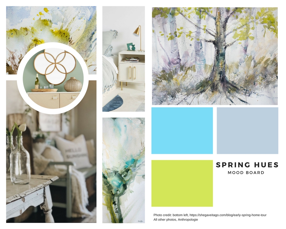
I'm loving my spring combination of teal, grey, green and violet, and you'll love it too. My spring collection of paintings will be available for purchase on May 10th, and pre-orders for the scarf and tote bag for this collection can be made now, here.
Place your pre-order by clicking here.
Is this delicious shade of turquoise part of your life too? Let me know in the comments!